21/09/18
Composition.
RULE OF THIRDS.

This photo is a good example of using the rule of thirds as the photo lines up well along the 9 lines. The Effiel Tower is perfectly against the far right vertical line and one third of the image is a view of the city whilst the other 2 thirds are of the sky.
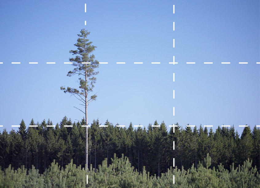
This photo uses the rule of thirds well as the tree on the left is placed against the right vertical line, making it stand out from the rest of the trees. Despite the fact some of the tops of the trees end slightly above the first horizontal line, it does not ruin the image or the effect of the rule of thirds. The photo shows one third of the image being only trees and the other two thirds as clear, blue sky; this is also an example of negative space.
NEGATIVE SPACE.

Negative space is used efficiently here as the plain, cool toned background allows the warm toned fur on the animal to contrast greatly. This makes it aesthetically pleasing.
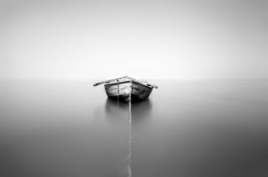
Despite all of this image having a similar colour scheme, the negative space in this photo allows all the attention direct straight to the boat. Lead in lines is also used in this image as the shadow of the boat in the water leads the eye right to the boat.
LEAD IN LINES.

This image is a good example of the lead in lines as the pier lead to the horizon and the clouds. The horizon lines also lead to the end of the pier where they connect on a perpendicular angle.
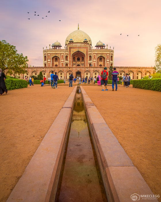
This image shows the lead in lines effect well as the vertical lines lead directly to the building in the distance. It allows the viewer to look straight at the building and appreciate the colours of the building and the sky.
FRAME WITHIN A FRAME.

This image presents a frame within a frame in a unique way as the object framing the White House is out of focus but is still very obviously framing it. It manages to still draw all the attention to the White House easily.

This image shows a natural frame rather than a manmade frame. The photographer has carefully taken the photo so the light as well as the framing is all making the eye concentrate on the building in the centre of the image.


FRAME WITHIN A FRAME.
I used the wooden frame for a manmade frame and had 2 people placed within the wooden frame with the intention of the attention of the viewer falling straight to them. I think the straightness of the image could be improved for a more emphasised effect.


LEAD IN LINES.
I used lines to lead the viewers eye to the subject of the photo, which in this case is a person. The lines are diagonal and all lead to where the subject of the photo is.


NEGATIVE SPACE.
I used a white, blank wall to contrast with the dark clothes the subject is wearing. This emphasises the effect of negative space and creates a sharp contrast between the wall and subject.

RULE OF THIRDS.
I used the rule of thirds in this photo to align the tree with the far left vertical line. I imagined an imaginary 9-square grid and attempted to line the tree up to the left vertical line. This makes the tree stand out and grabs the viewers attention right away.
28/09/18
The Exposure Triangle – Shutter Speed.
SHUTTER SPEED.
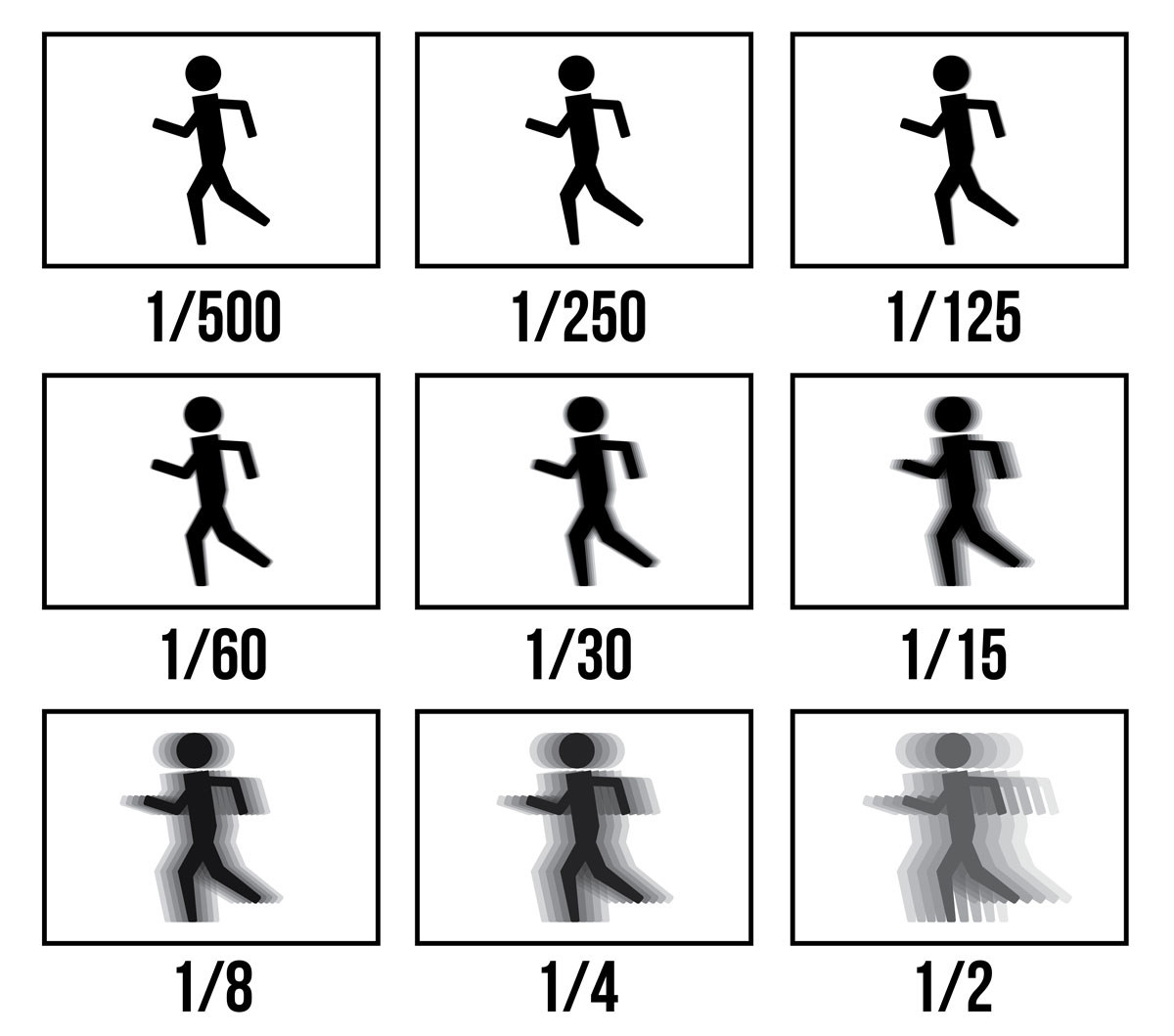
Shutter speed is the speed of which the two curtains (rear and front) close. The time the two curtains shut will match the setting of the shutter speed on the camera; this could be an eighth of a second or a 2,000th of a second. The amount of light in the image depends and corresponds to the shutter speed time; the shorter the shutter speed, the more exposed the image will be. If a photographer is trying to get a sharp image of somebody moving (EG, a sportsman), a short shutter speed will allow this image to happen. On a longer shutter speed, the effect of motion blur would be seen on the image.

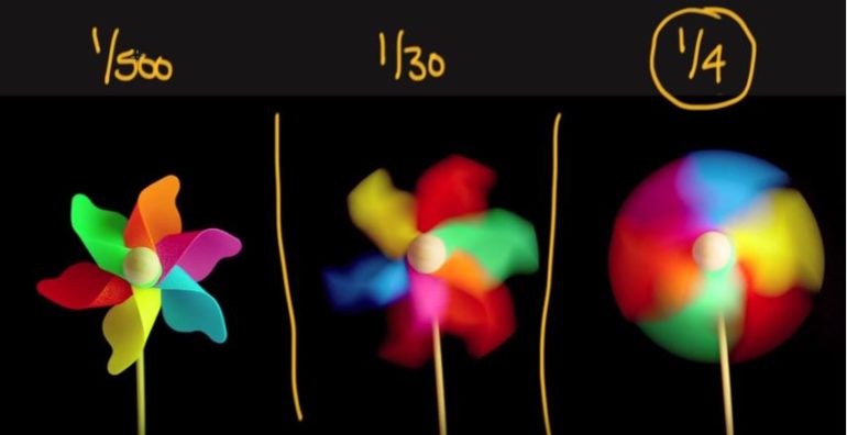
MY OWN IMAGES.

This was my first attempt at using shutter speed on a moving object. There is a lot of motion blur as the shutter speed was too low to capture a sharp image of the subject when in the air (the shutter speed was 1/8th of a second). If the shutter speed had been shorter, this image may have come out much sharper and with less motion blur. The exposure on this image is okay as it does not appear to be harshly over or under exposed.

This is a later attempt at capturing a moving subject with the correct shutter speed. This image has slightly less motion blur than the first but due to a mixture of poor timing and the wrong shutter speed, still does not have the desired sharp effect. The shutter speed on this image was shorter than the previous image (1/30th of a second) which still proved too long to capture a sharp image of the subject doing a vigorous movement. Again, the exposure seems okay as it is not over or under exposed.
 Despite this image not showing a lot of detail, the subject is in focus whilst in motion. Ellie kicked an empty can which you cannot see due to her foot being in the way. I had shutter speed set to 1/60th of a second and this image came out the sharpest. This image looks slightly over exposed due to the sunlight shining directly onto Ellie’s white shoes but it is not overly harsh on the eyes.
Aperture.
The aperture on a camera controls the brightness of the photo that passes through the lens and falls on the image sensor. There is a hole or an opening where the light travels through. Aperture is measured in f-stops, written as f/number. Moving from one f/stop to another doubles or halves the size of the opening in the lens and the amount of light getting through. As the number decreases, the aperture increases. For example, F/2 is much bigger than F/20.

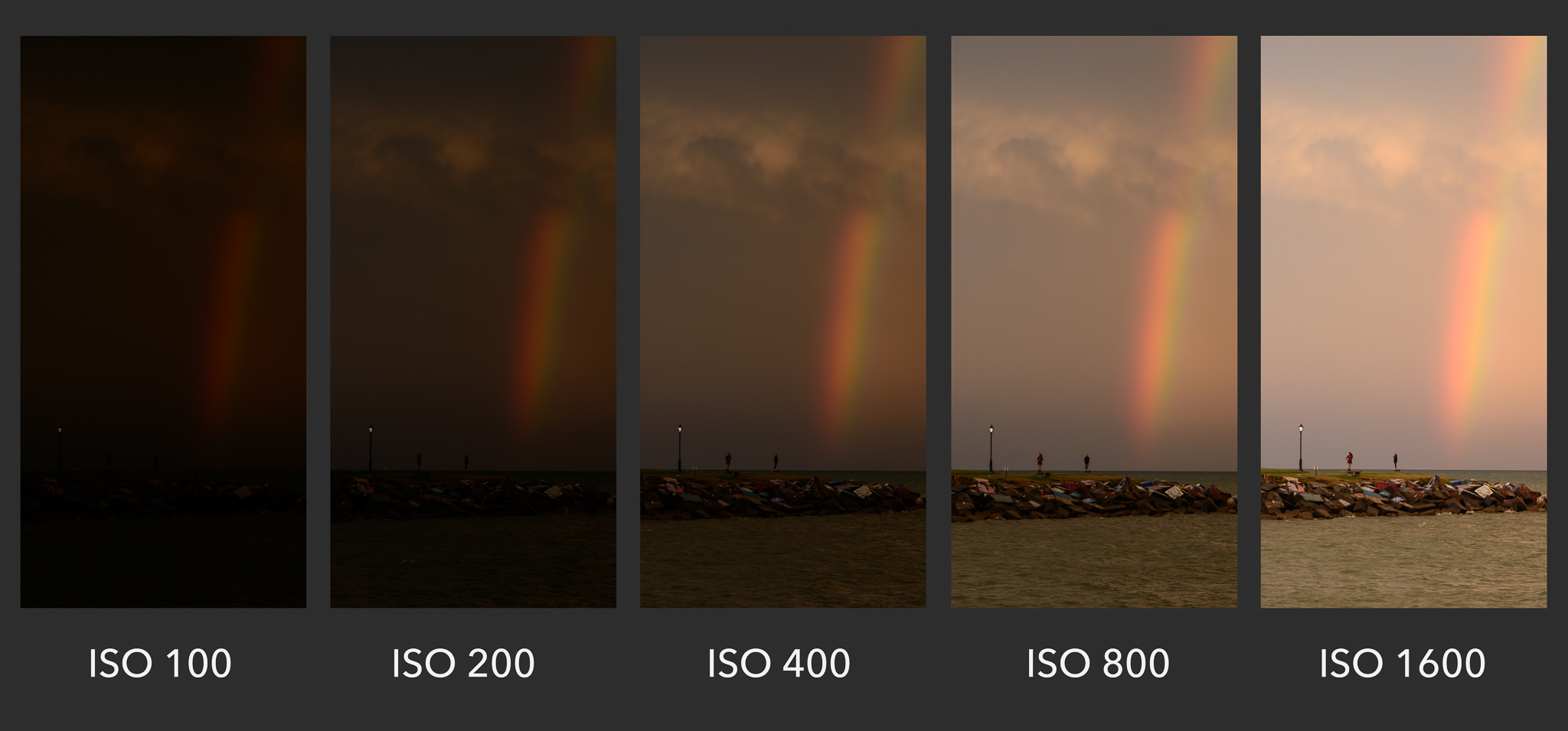
ISO.
ISO measures the sensitivity of the image sensor. ISO is measured in numbers and the lower the number, the less sensitive the camera’s image sensor will be. Higher numbers of ISO means your sensor becomes more sensitive to light, therefore allowing you to use the camera in a darker place. Using a higher ISO would be useful when capturing images of an indoor sports event where the light is dark and the subject is moving quickly. Four important things to think about when choosing the correct ISO is movement, lighting, grain and if you have a tripod or other means of steadying the camera.
Depth of Field.
Depth of field is the area in front and behind the focal point of the image. This area is not a fixed distance, it depends on the background and the focus point. This area can be described as shallow (where less of the image is sharp and in focus) or deep (where more of the image appears sharp). The depth of field impacts the technical and aesthetic effects of the image and it is important to getting the depth correct. An example of a shallow depth of field.
 An example of a deep depth of field.
My personal photos.

In this photo, I am using the deepest depth of field put of the three example images I took. Whilst the bottle is still in focus, the majority of the rest of the image is also sharp aside from the very rear trees which appear slightly softer.

This is the middle ground between the deepness and the shallowness of my images. Half of the image, including the bottle, is in focus and sharp, whilst the background is much more out of focus and soft. This makes the bottle stand out and contrasts with the background.

This is the shallowest depth of field out of my three examples. Much less of the image is sharp and the bottle stands out completely. The leaves in front of the bottle are in focus and fade into a soft blur after the bottle. The bottle remains sharp around the edges of it, bringing it forward on the image.
Weather Shot.

I took this photo on my canon 1200D with manual focus on. I used a high shutter speed to still the motion of the airplane in the sky. The exposure was turned down to capture the true colours of the sunset and make the bridge and trees appear more silhouette like. I slightly upped the saturation and pink hues to make the sunset look more dramatic.
Front Page Final Shot.

I took this photo on my phone meaning the settings were adapted automatically depending on the contributing factors; for example, the focus and the exposure. The sky acts as negative space, making the buildings contrast with the sky and stand out more. There is loads of space as a result of this which makes it easy to put a masthead and secondary text on the cover.
